The Secret Life of Projects
Working with Arup to translate email archives, file data, and billable hours into an interactive presentation revealing the digital shadow of a project as it unfolds over time.
As one of OOM Creative’s design services, we add value to client data by translating large and complex datasets into interactive and informative visualisations. In this project we worked with Arup to translate email, file, and project billable hours into an interactive presentation entitled The Secret Life of Projects.
The project illustrates the relationships between human and digital activity by visualising the digital shadow — files, emails, and more — of a project as it unfolds over time.
Watch the email network visualisation on Vimeo →
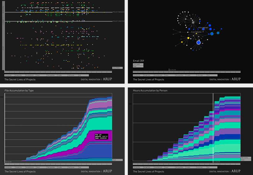
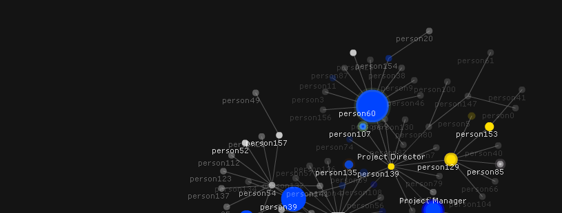
One of the most interesting visualisations from the project plots an email archive over time. It’s a unique piece of visualisation that grows an email network purely from tracing who first introduces another recipient into the email conversation. The visualisation also shows:
- The different locations of the people through colour (blue = city 1, yellow = city 2, grey = N/A)
- The billable hours for the project for each person through the size of the node
- Who is sending and receiving emails through the pulsing and decay of nodes — nodes fade over time when not part of the conversation
Other visualisations in the presentation included a matrix of email senders aligned to cost centres, and a stack visualisation of the 10,000 files used in the project.